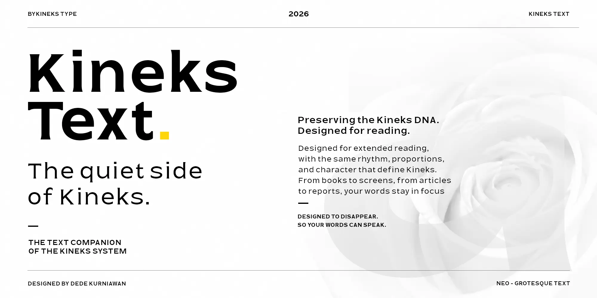
Kineks Text
About
Kineks Text is a neo-grotesque text typeface designed for readability, extended reading, editorial typography, and digital publications. It is the text companion to Kineks Display, bringing the distinctive Kineks Typeface into a more restrained and reading-focused design.
Designed for books, magazines, articles, reports, websites, blogs, and other long-form content, Kineks Text features a generous x-height, open apertures, clear letterforms, balanced proportions, and carefully tuned spacing for a smooth and consistent reading rhythm.
VARIABLE TYPE SYSTEM
2 Axes
Typography often disappears when it works well. A well-made typeface does not demand attention from the reader.
px
em
Click the specimen text to edit it. Adjust the variable axes, size, leading, and tracking below.
Character Set
389 Glyphs
A
LANGUAGE SUPPORT
90 Languages
Afrikaans · Albanian · Asu · Basque · Bemba · Bena · Breton · Catalan · Chiga · Colognian · Cornish · Croatian · Czech · Danish · Dutch · Embu · English · Esperanto · Estonian · Faroese · Filipino · Finnish · French · Friulian · Galician · German · Gusii · Hungarian · Icelandic · Indonesian · Irish · Italian · Kabuverdianu · Kalaallisut · Kalenjin · Kamba · Kikuyu · Kinyarwanda · Latvian · Lithuanian · Lower Sorbian · Luo · Luxembourgish · Luyia · Machame · Makhuwa-Meetto · Makonde · Malagasy · Maltese · Manx · Meru · Morisyen · North Ndebele · Norwegian Bokmål · Norwegian Nynorsk · Nyankole · Oromo · Polish · Portuguese · Quechua · Romanian · Romansh · Rombo · Rundi · Rwa · Samburu · Sango · Sangu · Scottish Gaelic · Sena · Serbian · Shambala · Shona · Slovak · Slovenian · Soga · Somali · Spanish · Swahili · Swedish · Swiss German · Taita · Teso · Turkish · Upper Sorbian · Uzbek (Latin) · Volapük · Vunjo · Walser · Zulu